My Work
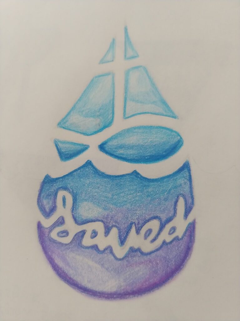
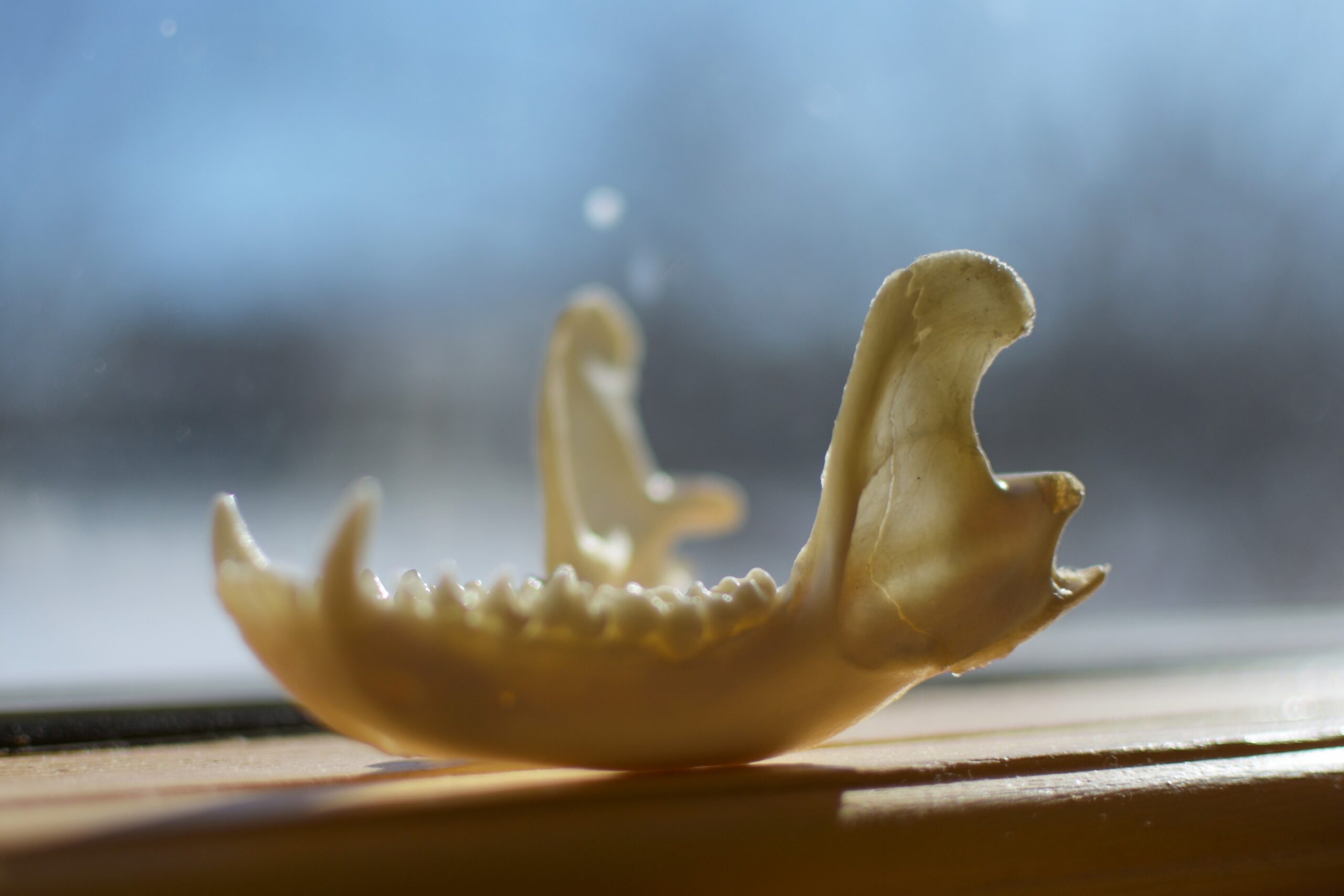
My inspiration for this tattoo was the Christian cross, however, I ended up combining different symbols that relate to Christianity. The overall tattoo is in the shape of a water droplet, symbolizing God’s grace. The droplet is divided using negative space, forming a sailboat on top of ocean waves. The boat’s sails form the cross, while the body forms an ichthus (Christian fish symbol). At the lower part of the droplet is the word “Saved” written in cursive.
I first drew a sketch of the tattoo and lightly erased the sketch until it was barely visible. Then, I coloured it using coloured pencils, making it more like a water droplet. Lastly, I used Pixlr Express to edit the photo of my tattoo.
Stop and Think
Choose one of the two “Stop and Think” questions in this lesson:
– Is positive space more important than negative, or are they equally important? Defend your opinion with a visual art example.
– When looking at the painting below, which colour is the subject? Based on your understanding in this lesson, describe how positive and negative space can be subjective.
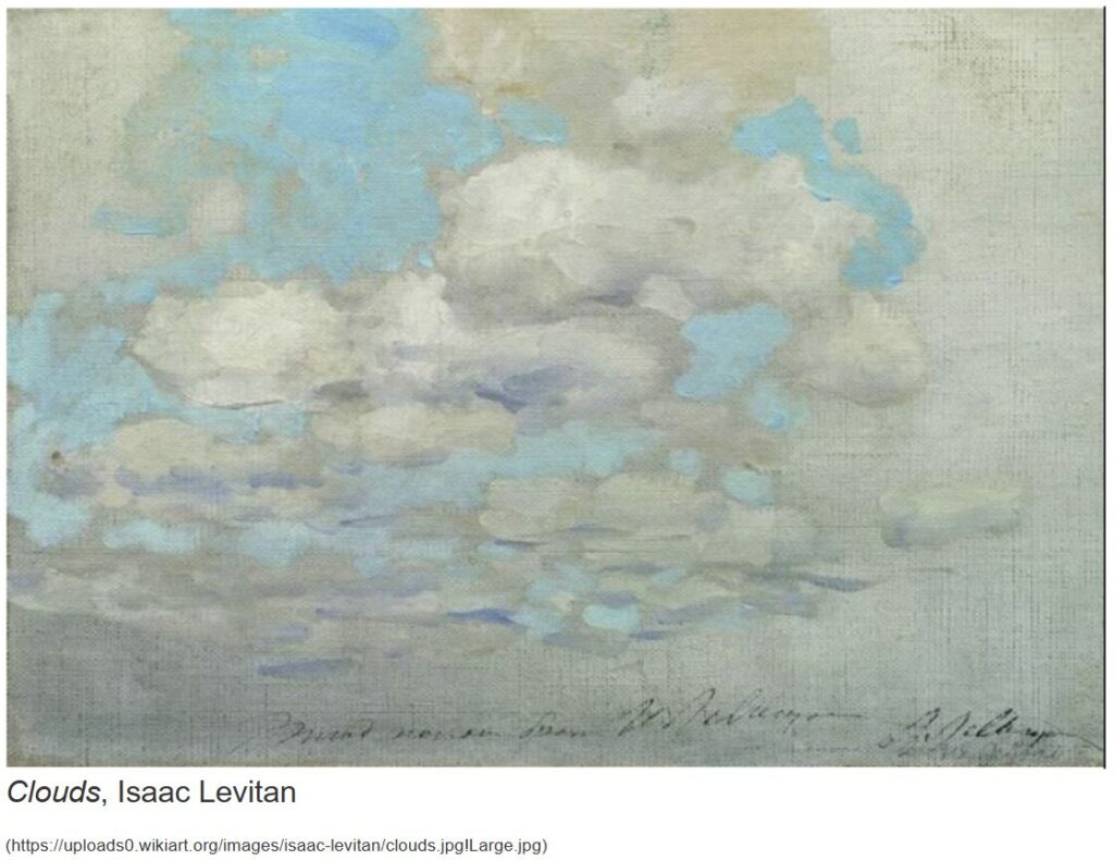
The blue sky is the subject in Clouds because it was the first colour that caught my attention. On the other hand, the grey clouds are minor (i.e., less noticeable) because their colours are very similar to the background. Positive and negative space can be subjective by how people perceive the world differently. One person may view an area as positive space, but another person may view the same area as negative space.
Artist Connection
We are so lucky to have brilliant skies in Saskatchewan. To connect with Monet, you will capture the skies using a digital camera (on your phone is fine!).
Your challenge is to experiment with the rule of thirds when taking photos. If you want, you can turn on the grid function, but this is not necessary.
Choose two different subjects to capture in an outdoor space (be sure you can see the sky!). These can be human, an object you bring out, or something found in nature. For each, take at least three different photos, changing the subject’s positioning based on the rule of thirds.
Finally, share all six photos you have taken on your website. Choose your favourite from each subject and explain why in a sentence or two.
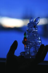


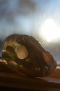
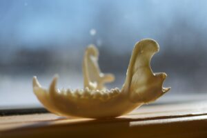
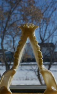
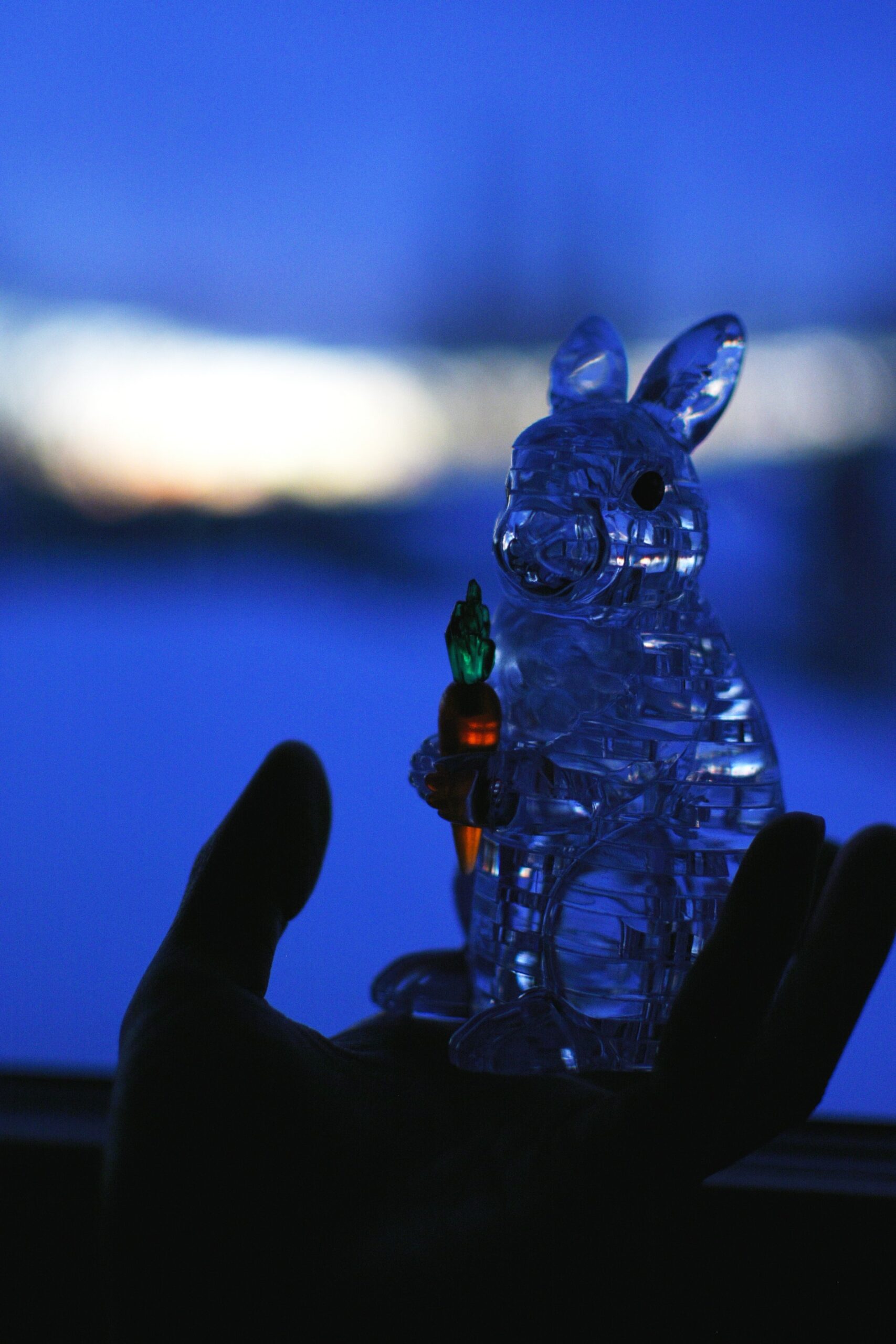


For Subject #1, I prefer the first photo because it shows the carrot’s colour, adding more interest and contrast. For Subject #2, I prefer the second photo because the background is not too distracting, bringing more attention to the subject.